September 14, 2012
| by Kathleen O'Toole
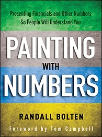
Whether you make your living with numbers or just occasionally have to communicate your credit worthiness to your banker, you can make or break your reputation by how you present those numbers, says Randall Bolten, a former chief financial officer to high-tech companies BroadVision, Phoenix Technologies, Arcot Systems, BioCAD, Inc., and Bowers Imaging Technologies, as well as a former controller for Oracle and Tandem Computers. John Wiley & Sons recently published Painting with Numbers, Bolten’s book on presenting financials and other numbers to audiences you care about. Bolten, Stanford MBA ‘77 and now CEO of Lucidity consulting, spoke to Kathleen O’Toole about his tips on improving numerical communication. Here are excerpts:
Why did you decide to write this book?
Randall Bolten: During the 20 years I was a CFO in Silicon Valley, it became increasingly clear to me that small differences in the way numbers are presented can have a huge impact on how well they are understood by the audience. And these small differences were about communications skill, not about any particular math skill. For example, you don’t have to be a numbers genius to right-justify your numbers, which makes it easier for your audience to quickly focus on the bigger numbers. You don’t have to be a numbers genius to remember to put a title on your reports so people can look at the page and instantly see what the report is about. And you don’t have to be a numbers genius to throw in some ratios that can add meaning and context to your raw numbers. Because presenting numbers is such an important communication skill, I coined the word quantation to describe it so that it would have a one-word name, on par with writing and speaking. One way to think about my book is that it is a 300-page pep talk. It says that to present numbers effectively, you have to follow some communication rules, and often not much more than that.
Your book lists some of the “deadly sins” of presenting numbers. Can you give an example?
I’m very fond of deadly sin number 17, which relates to PowerPoint presentations. It’s when you say, “I know most of you can’t read the numbers on this slide, but … .” People in the audience hate that, but I am the only person I know who ever actually did anything about it. At one company where I was CFO, we had a worldwide sales meeting where one regional manager after another was to give a presentation. It’s the kind of meeting where, if you are presenting, you want the CFO in the room, and the first guy up said exactly that about one of his more unreadable slides. I was sitting in the back of the room and I raised my hand and said, “It’s too late for this gentleman, but everyone else in this room has at least an hour. The next time that happens I’m walking out of this room, and I’m not coming back for the rest of the day.” And guess what: A miracle occurred. Not one more slide was unreadable from the back of the room.
In the book, you write that confusion about numbers causes costly mistakes. Give an example.
Let’s take chronological order. Some people like presenting years, quarters, or months in reverse chronological order so the most recent year is closest to the caption. But when people think in chronological order, they think forward in time, not backward, and in English, we read from left to right. So I think it’s weird when data on years or quarters are presented in reverse chronological order. But the worst sin is presenting a package where some slides or pages are in forward chronology, and some are in reverse. You risk the reader reaching the absolutely diametrically wrong conclusion about a trend.
Do you favor graphs or tables for displaying numbers?
Graphs are useful if you are trying to get somebody to recognize a trend or pattern. But if you’re just conveying information, they are very inefficient. But not everyone appreciates this distinction between tables and graphs, and so they say things like, “I’m a very visual person — just give me some graphs.” Unfortunately, to some people that’s as if they were saying, “When you send me a memo, don’t put too many big words in it.”
One of the worst problems is that people assume that both presenting and understanding numbers are math skills. A person who says right off the bat, “I’m no good with numbers,” will probably make no effort to understand the numbers, and give no feedback to the presenter. If more people said to the presenter, “I have a 3-digit IQ. If I can’t understand the information you are presenting to me, maybe it’s not my fault,” the presenters would spend more time making their reports more comprehensible.
Is your advice aimed at accountants and CFOs or people who occasionally have to present numbers to others?
It’s for both. If you present numbers a lot — if you are an accountant, an engineer, a health care analyst — how you present numbers is a critical part of your personal brand image. There are a whole lot of other professions — litigator, investor relations professional, project manager — where presenting numbers is not quite as critical to your personal brand image, but when numbers are involved, it’s usually because the stakes are very high. It’s a little like when a standing rib roast is served, the dinner is more important. Even if you never present numbers except when you are applying for a mortgage, it’s important for you to present that information clearly.
For media inquiries, visit the Newsroom.


