The Image element features an image within a panel pane.
Some image sizes are controlled by the backend of Drupal, like on our Insights landing pages. The authoring environment in this section provides authors with image sizes for teaser and other needs, and recommended image sizes for article pages. In other places we recommend certain image sizes to increase visual consistency across the site.

Image Sizes
- Standard Image Ratio - for most images we recommend a ratio of 7:1, so an output image could 170px by 100px. This is a fairly standard rectangle, and matches our pattern of Drupal structured images in sections like Insights. If you expect to use a rectangle, we recommend using this ratio with a few exceptions.
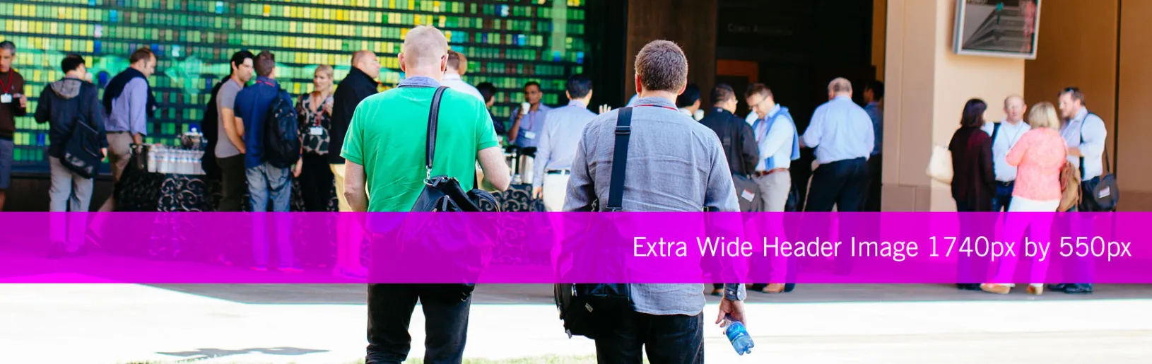
- Exception: Extra Wide Header Image - for images that sit at the very top of the page, either above or below the H1, we recommend an image size of 1740px by 550px. The image at the top of this page is an example of this size.
- Exception: Wide Header Image - for images that sit at the very top of the main content well, below the H1, but above intro copy, on a page with a right sidebar, we recommend an image size of 1160px by 550px. This size is a bit more narrow vertically than our standard rectangle ratio. Feel free to use this image size in the main content well, for contextual images as well. Being a little more narrow than our standard rectangle, it will gives users more space on their viewport for textual content, verses just tall imagery.
Image Resolution
Screen resolution is always changing. Currently, our considerations include standard display resoultion at 72dpi and retina resolution at 144dpi (devices and now some laptops/monitors). That said, there are a few things we can do and can’t do to make as many of our images crisp and clean across the site.
Meeting Retina Resolution
The best display of images will be those that meet retina requirements, but we can only do this for images that are constrained by width in Drupal. This means that for images that span entire content wells, like our Extra Wide Header Image and our Wide Header Image, we want to create those source images at double the actual dimensions. Therefore, the Extra Wide Header Image is spec’d at 1740px by 550px instead of 870px by 275px. In a retina display, that will achieve the crisp and clean image we want.
Unable to Meet Retina Resolution
